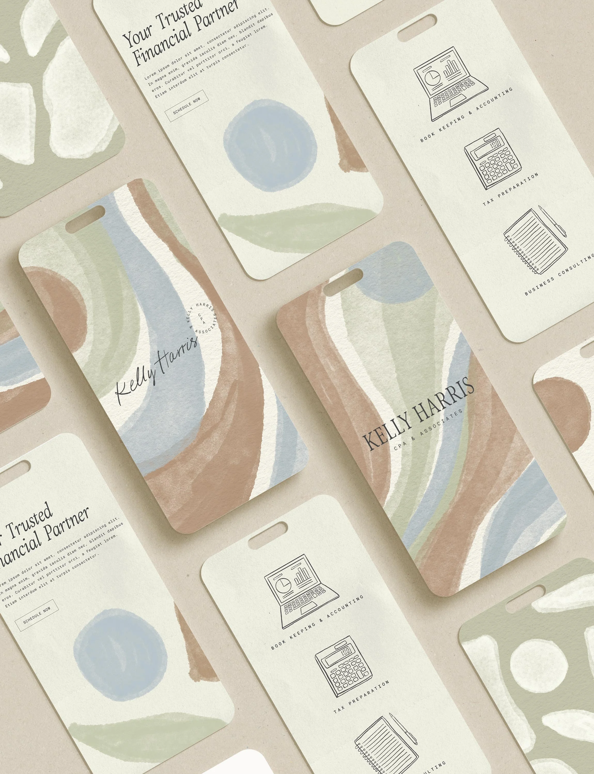
A Case Study: Kelly Harris CPA & Associates Brand Identity
When my accountant Kelly Harris approached me to design a logo for her business Kelly Harris CPA & Associates I was so excited but at first I said no. You might be asking why? I explained to Kelly I don’t just design logos, I design brand identities. A full brand identity includes colors, type, icons, brand messaging, backgrounds and textures which collectively represent a brand’s personality and values.
Here’s why I only provide brand identities for my clients and not just logos:
A LOGO IS JUST THE START
Alone, it doesn’t convey the full essence of a brand. A full brand identity ensures that all visual elements are consistent across different platforms and media, strengthening brand recognition.
A BRAND IDENTITY TELLS A STORY
Brand identities tell a story that goes beyond a logo, giving depth to the brand’s narrative creating a stronger relationship with customers.
PROFESSIONALISM & CREDIBILITY
A complete brand identity communicates professionalism and attention to detail which enhances the perceived value of the brand.
EMPOWERING CLIENTS
Providing my clients with a full brand identity including brand guidelines, empowers them with the tools to maintain a clear direction on how to apply their brand visuals and use their logo to ensure consistency.
After explaining these points to Kelly, she quickly realized the value of having a brand identity so we excitedly moved forward with a beautiful brand that feels like a breath of fresh air!
The Challenge
Kelly has a down to earth approach to accounting, book keeping and tax preparation which gives her customers a sense of security. Before coming to me, Kelly had a simple black and gold business card printed from a print on demand shop so she really wanted a brand identity that represented her business and values. Because her customers are looking to her to handle their books for their business she really wants them to feel a sense of relief and ease that they are in good hands while also having a brand that looks professional and reliable.
The Goal
Design a professional and reliable brand identity that conveys a sense of relief, ease and groundedness in accounting, bookkeeping and tax preparation for Kelly’s Accounting business.
The Solution
Kelly and I first started with a brand deep dive where we discovered her core brand values and mission. I also helped Kelly brainstorm LLC names and make sure they were available to register.
Here’s a breakdown of what our process looked like:
Brand Questionnaire Meeting: Met to discuss her brand questionnaire, dissect her brand values and mission as well as go over the timeline and what to expect. Afterward I brainstorm taglines and brand statements to get a sense of the brand voice.
Moodboard & Color Palette: Based on our meeting, I provided Kelly with a moodboard and color palette to give her a sense of what I think her brand identity could look like based on her values and mission. This included type treatment, imagery, textures, and illustrative elements that together gave an overall vibe of what her brand identity could feel like. We review together to make sure we were both in alignment.
Logo Design: I then created her primary logo, secondary logo, and brand marks, drawing inspiration from the mood board and color palette. Typically, I offer my clients one primary logo option, one secondary logo, and two brand marks, along with opportunities for revisions. This approach gives clients the flexibility to choose the most suitable logo or brand mark for different situations. My clients often appreciate this method as it reduces the stress of selecting "the best logo," which is why they sought my expertise in the first place. With over 10 years of experience in design, I guide them in making the optimal choice for their brand, based on insights from our brand questionnaire and mood board. Client feedback is always a priority, and I incorporate it as we move forward into developing the full brand identity.
Brand Identity Design & Guidelines: This is the fun part when it all comes together! I start by pulling textures, illustrating backgrounds and icons and creating a few graphics that convey the brand values and mission. I design the brand guidelines which is a full comprehensive guide on the brand essence, key words, colors, fonts, brand elements, imagery direction and logos and how to use them. Kelly was “WOW”ed and absolutely loved how it conveyed ease, relief and her down to earth approach.
Final Delivery & Download: After Kelly reviewed her Brand Guideline, I set a meeting for us to discuss all her brand assets and how to use them. I clipped every individual element so Kelly can easily use them in Canva or anywhere she pleases. All are PNGs with transparent backgrounds. I also incorporated imagery from the brand guidelines that she can use on social media. She was thrilled to be able to easily download everything directly from a dropbox link I provided.
The Results
Kelly Harris CPA & Associates now has a professional and beautiful brand identity creating a sense of ease and relief for her accounting, book keeping and tax preparation services. I am absolutely thrilled she approached me to work on her brand identity and am happy she is head over heels in love with how she can present her business visually. I look forward to seeing how her business grows!
I’d love to help support your rebrand for your business!
With over 10+ years of design expertise in branding, illustration and product design, I’m confident I can help your brand stand out amongst competitors in a saturated market. I’ve worked with brands like Toys R Us, Skip Hop, Christmas Tree Shops and now Raymour & Flanigan to help take their brand identities to the next level and I can help yours too!


